


Mangaka’s of the world, CIAO! Today we will continue talking about paneling. Specifically, how to create the perfect “Koma-wari” (“paneling” in Japanese) by analysing, in great detail, the very first chapter of my favourite manga… “Fist of the North Star” by Hara Tetsuo sensei!
But before we start… do you remember what we covered last week? There are 2 different types of paneling pages, the rough ones (a page with a small number of panels) and dense (a page with many panels, containing a lot of information). 
 The proper order of Koma-wari for a long story, is to start with a rough panelling approach at the start of the manga, then dense in the middle, followed by rough at the end: this will ensure your manga is easy to read while giving the story a dynamic tempo!
  So, now that we have recapped the basic structure of a professional manga, let’s dig further into Koma-wari by looking at a professional title… CHAPTER 1 OF FIST OF THE NORTH STAR: A CRY FROM THE HEART”!
 The opening scene of episode one is a powerfully HUGE single panel! As we discussed last week, the principle of any good manga is to start the story with a “Rough” Koma-wari, exactly like the one here, that grabs the reader instantly!!
Furthermore…
The opening scene of episode one is a powerfully HUGE single panel! As we discussed last week, the principle of any good manga is to start the story with a “Rough” Koma-wari, exactly like the one here, that grabs the reader instantly!!
Furthermore…
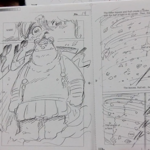
 Even though it has higher density rate than the previous one, impact and readability are not impaired. As this is Rin’s first appearance in the story, the standing appearance of Rin (on the left side of the page) is laid out in a form of a drawing, outside of the paneling. Consequently, the appearance of Rin stands out on this “dense” page, making her literally stand out.
  This is also a dense page, but the reader never gets lost in the order of reading. Look carefully at the page, the narrow width and thick width described last week has been used successfully!
  Manga creators should never forget how to guide their readers. Finally, the last page of episode one.
  Again, we see a charming use of “rough” panelling, leaving the reader to ponder “what will happen next?”. I hope you enjoyed this little journey into the manga making world! Alas, I can’t explain everything in such short an article, but I am sure that by using what you have learned in today’s episode, you can go and find your personal examples of “Dense” and “Rough” Koma-wari! So the next time you read your favorite manga, focus on the “Koma-wari” and the way it manipulates the reading order.
When you do, make sure to share them on your SNS by tagging me or using the hashtag #mangasos 😉
Next week, I will introduce techniques to manipulate time with the frame rate. Looking forward to to! CIAO!
Again, we see a charming use of “rough” panelling, leaving the reader to ponder “what will happen next?”. I hope you enjoyed this little journey into the manga making world! Alas, I can’t explain everything in such short an article, but I am sure that by using what you have learned in today’s episode, you can go and find your personal examples of “Dense” and “Rough” Koma-wari! So the next time you read your favorite manga, focus on the “Koma-wari” and the way it manipulates the reading order.
When you do, make sure to share them on your SNS by tagging me or using the hashtag #mangasos 😉
Next week, I will introduce techniques to manipulate time with the frame rate. Looking forward to to! CIAO!
FOLLOW ME for more Kakimoji and manga tips! Twitter Facebook …and remember to use the hashtag #mangasos 😉
The proper order of Koma-wari for a long story, is to start with a rough panelling approach at the start of the manga, then dense in the middle, followed by rough at the end: this will ensure your manga is easy to read while giving the story a dynamic tempo!  So, now that we have recapped the basic structure of a professional manga, let’s dig further into Koma-wari by looking at a professional title… CHAPTER 1 OF FIST OF THE NORTH STAR: A CRY FROM THE HEART”! The opening scene of episode one is a powerfully HUGE single panel! As we discussed last week, the principle of any good manga is to start the story with a “Rough” Koma-wari, exactly like the one here, that grabs the reader instantly!!
Furthermore…
So, now that we have recapped the basic structure of a professional manga, let’s dig further into Koma-wari by looking at a professional title… CHAPTER 1 OF FIST OF THE NORTH STAR: A CRY FROM THE HEART”! The opening scene of episode one is a powerfully HUGE single panel! As we discussed last week, the principle of any good manga is to start the story with a “Rough” Koma-wari, exactly like the one here, that grabs the reader instantly!!
Furthermore…
 DON!
DON!
Even though it has higher density rate than the previous one, impact and readability are not impaired. As this is Rin’s first appearance in the story, the standing appearance of Rin (on the left side of the page) is laid out in a form of a drawing, outside of the paneling. Consequently, the appearance of Rin stands out on this “dense” page, making her literally stand out.  This is also a dense page, but the reader never gets lost in the order of reading. Look carefully at the page, the narrow width and thick width described last week has been used successfully!
  Manga creators should never forget how to guide their readers. Finally, the last page of episode one.
  Again, we see a charming use of “rough” panelling, leaving the reader to ponder “what will happen next?”. I hope you enjoyed this little journey into the manga making world! Alas, I can’t explain everything in such short an article, but I am sure that by using what you have learned in today’s episode, you can go and find your personal examples of “Dense” and “Rough” Koma-wari! So the next time you read your favorite manga, focus on the “Koma-wari” and the way it manipulates the reading order.
When you do, make sure to share them on your SNS by tagging me or using the hashtag #mangasos 😉
Next week, I will introduce techniques to manipulate time with the frame rate. Looking forward to to! CIAO!
Again, we see a charming use of “rough” panelling, leaving the reader to ponder “what will happen next?”. I hope you enjoyed this little journey into the manga making world! Alas, I can’t explain everything in such short an article, but I am sure that by using what you have learned in today’s episode, you can go and find your personal examples of “Dense” and “Rough” Koma-wari! So the next time you read your favorite manga, focus on the “Koma-wari” and the way it manipulates the reading order.
When you do, make sure to share them on your SNS by tagging me or using the hashtag #mangasos 😉
Next week, I will introduce techniques to manipulate time with the frame rate. Looking forward to to! CIAO! FOLLOW ME for more Kakimoji and manga tips! Twitter Facebook …and remember to use the hashtag #mangasos 😉
RELATED ARTICLES :
-

Manga NAME Practicals 2: “BONOLON the Forest Warrior” – Japanese Manga 101 #034
-

YOKAI CASE FILE #4 – Baba Yaga
-

Kakimoji S.O.S. #11 – Be SILENT! Kakimoji Time
-

Kakimoji S.O.S. #22 – Tsugihara Sensei's Kakimoji
-
The FOUR Part construction "Ki-Sho-Ten-Ketsu" – Japanese Manga 101 #049
-

SMAC! MANGA DOJO #9 – "4 'IFs' that creates Manga"
-

Manga creation with Pro editor 3- Japanese Manga 101 #045
-
SMAC! MANGA DOJO #5 – "5 STEPS TO CREATING MANGA"
-
SMAC! MANGA DOJO #7 – "Do not fear the 'ROYAL ROAD'!!"
-


"Six emotions" that you know instinctively / JapaneseManga101 #004