


The fantastical worlds in manga have no audible sound or movement, a result of the action being played out in two dimensions. But do your lingering memories of reading manga recall static and silent characters? Or do you remember them bursting from the page?! The expressive technique known as Kakimoji perfectly introduces the three dimensional concepts of sounds, motion and smells, enabling manga to be enjoyed on many levels. Today we will look at the design of Kakimoji characters, from size to nuance (…a big thank you to Penmaru for his amazing drawings!) 
 You’re welcome! Fonts makes all the difference! Take a look at this first drawing…
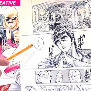
 Here we see a girl slapping a boy. Simple enough, but we’re left with a few questions. How strong is the slap? What kind of scene is this, dramatic or comedic? Without the help of Kakimoji it’s hard to tell! Let’s add the Kakimoji “BISHI” (tapping sound), in a variant forms and we’ll see how much the scene changes with this simple addition. ① Standard Design
 This “BISHI!” is a slightly large, rounded design in a white. Colour choice denotes the kind of sound needed for the action. White is able to convey a standard level of sound, neither round nor quiet, though still firmly depicting the hand making contact with the boy’s face. ② Strong Design
 “BISHI!” designed in a rough font, in black. By overlaying the Kakimoji across the scene, we get the impression that this is a mighty slap! Also, the use of fuzzy characters implies a very violent action, packed with aggression. I wonder what this boy said?! ③ Not so powerful design
  “BISHI” here is shown in a small speech bubble. This method of showing Kakimoji helps to illustrate a quiet, weak action. The use of the speech bubble is an effective way of showing quiet or cute sound. ④ Comical design
 The action is now completely different from the ones above! Can you tell the main difference? The characters are rounded and in white, giving us a soft, almost squidgy effect, but that’s not it… The main difference is Hiragana! Hiragana, we immediately recognize a comedic scene. Lacking the seriousness of Katakana, much like those used in Takahashi sensei’s “Urusei Yatsura”, this method shows us that the slap is playful, amounting to annoyance rather than a serious incident.


You’re welcome! Fonts makes all the difference! Take a look at this first drawing… Here we see a girl slapping a boy. Simple enough, but we’re left with a few questions. How strong is the slap? What kind of scene is this, dramatic or comedic? Without the help of Kakimoji it’s hard to tell! Let’s add the Kakimoji “BISHI” (tapping sound), in a variant forms and we’ll see how much the scene changes with this simple addition. ① Standard Design This “BISHI!” is a slightly large, rounded design in a white. Colour choice denotes the kind of sound needed for the action. White is able to convey a standard level of sound, neither round nor quiet, though still firmly depicting the hand making contact with the boy’s face. ② Strong Design “BISHI!” designed in a rough font, in black. By overlaying the Kakimoji across the scene, we get the impression that this is a mighty slap! Also, the use of fuzzy characters implies a very violent action, packed with aggression. I wonder what this boy said?! ③ Not so powerful design “BISHI” here is shown in a small speech bubble. This method of showing Kakimoji helps to illustrate a quiet, weak action. The use of the speech bubble is an effective way of showing quiet or cute sound. ④ Comical design The action is now completely different from the ones above! Can you tell the main difference? The characters are rounded and in white, giving us a soft, almost squidgy effect, but that’s not it… The main difference is Hiragana! Hiragana, we immediately recognize a comedic scene. Lacking the seriousness of Katakana, much like those used in Takahashi sensei’s “Urusei Yatsura”, this method shows us that the slap is playful, amounting to annoyance rather than a serious incident. And look what happens when you adjust the background effects with Kakimoji!
● Let’s read manga with a focus on Kakimoji! By carefully choosing the style and design of Kakimoji, using size, color and arrangement, you can effect the way a manga is directed. The next time you pick up your favourite manga, cast a critical eye and take not of the Kakimoji used. You might be surprised how much Kakimoji leads the story!RELATED ARTICLES :
-

SMA15 Moments of… CRYING: Yako Gureishi
-

SMAC! MANGA DOJO #2 – "Manga starts from a doodle!"
-
SMAC! MANGA DOJO #17 – "How to make a charming character ③ 3 Principal Elements you need in a Character"
-

Q&A with MANGA PRO Session 2 – Japanese Manga 101 #039
-
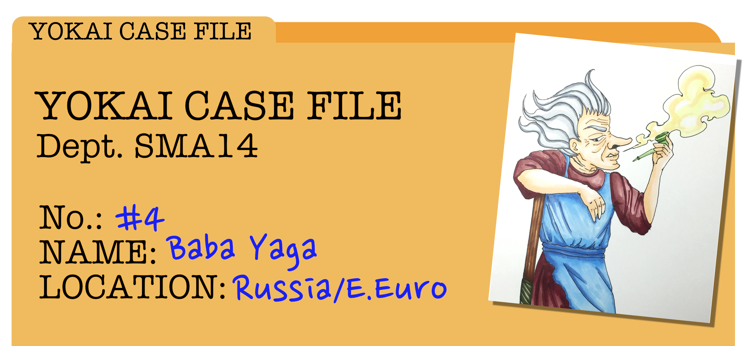

YOKAI CASE FILE #4 – Baba Yaga
-

"Draw to Flow" Japanese Manga 101 – #003 Art of Paneling Basics 1
-
Kakimoji S.O.S. 6 – KAKIMOJI HUNTER
-

[NEW SERIES!!!] MANGA S.O.S. #01 – Paneling
-
Q&A with MANGA PRO Session 3 – Japanese Manga 101 #040
-
Why is a NAME called a NAME? / 5 criteria to watch out for – Japanese Manga 101 #028