


準大獎
300,000 JPY
熊本頒獎典禮
「以日本出道為目標」的短期講習邀請
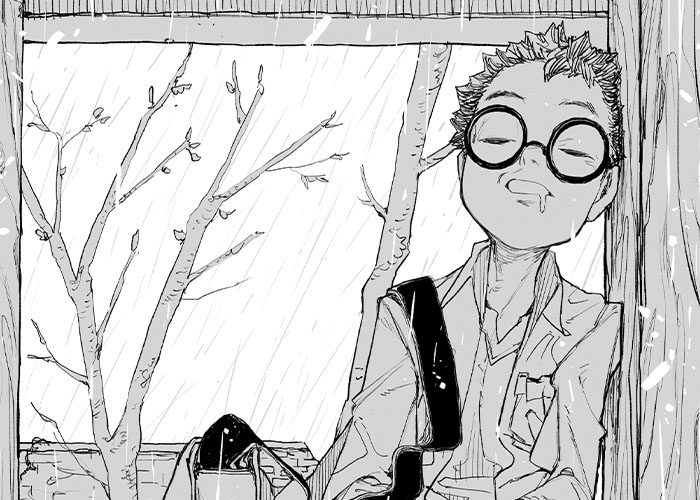
TITLE Ode to the Anime Kid
CREATOR Leopard Gecko
Read this MANGA
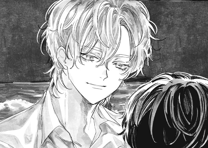
在角色刻畫上表現優秀,畫技精湛,運用跨頁呈現兩人互動與時間流逝的構想非常出色。雖然一開始我會希望能再更深入描寫角色關係,但後來看到作者在最後的第16頁已經充分呈現了這部分,並帶來令人滿足的情緒共鳴。 唯一一點讓我在意的是,那位喜愛動畫的角色在最後畫出結合素描與動畫風格的作品,讓人對他是否真的「有所成長」感到疑慮。如果是我,我會安排他完成兩件作品:一件是應試用的素描,另一件是結合素描與動畫的創作。 不過除此之外,開頭與結尾以動畫角色出拳的畫面相互呼應,呈現出的演出構成相當精彩。
The way you differentiated the characters was excellent. You are incredibly artistically talented, and your use of the double-page spread to show the two characters’ interactions, as well as the passage of time, was wonderful. Initially, I felt the depiction of the characters’ relationship was lacking in depth, but I was satisfied to find that you developed it further around page 16, which gave the story a real sense of catharsis. There was one small point that caught my attention at the end. The character who loves anime ends up creating a work that mixes traditional drawing and anime. This made me wonder whether he truly “grew” as a character. If it were me, I might have had him complete two pieces: a skilled, traditional drawing for his entrance exams and a separate work that combines traditional drawing with anime. That being said, I thought it was an excellent storytelling choice to show the anime character throwing a punch at both the beginning and the end.

優秀獎
100,000 JPY
熊本頒獎典禮
「以日本出道為目標」的短期講習邀請
TITLE Where Sad Becomes Sand
CREATOR Ciwaz
Read this MANGA
我認為如果能再描繪的更加細緻一些,作品的完成度就會變得非常高。 在第4頁翻頁的瞬間,出現了世界觀的轉折,讓我感受到作者的「漫畫功力非常出色」。 不過,稍微有點可惜的地方是黑髮角色的立場出現了變化,這可能會讓讀者感到混亂。但翻頁時白髮角色的出現讓人印象深刻,也讓這個場景變得難以直接比較優劣。 角色的造型設計非常細膩,表情刻畫也十分到位,具備了吸引讀者迷上角色的美感。
With just a bit more attention to detail, I believe this work could have achieved an exceptionally high level of perfection. The page-turn on page four marks a turning point in the way the world is presented, and it made me think, “This creator really understands manga.” However, one thing I noticed was the change in the black-haired character’s position. When a character’s position shifts between panels, it can easily confuse readers. At the same time, the placement of the white-haired character at the page-turn was very striking, so it was difficult for me to judge this scene. The characters’ delicate designs are excellent, and their facial expressions are beautifully depicted. There’s a captivating quality that draws the reader to the characters.

準優秀獎
30,000 JPY
熊本頒獎典禮
「以日本出道為目標」的短期講習邀請
TITLE Sunshower
CREATOR 茜Cian
Read this MANGA
我認為作品的演出表現非常清楚明確,是讓10個人看,10個人都能簡單讀懂的故事。雨男與晴男相遇的場景,以及田野上降下太陽雨的那一幕都讓人印象深刻。 對於跨頁的運用十分出色,畫技也很優秀,從分鏡細節到整體畫面都描繪得很用心,可以看出作者充分考慮了讀者的閱讀體驗。 不過,將「雨男」帶到缺水田地的場景表現得過於直接,略顯平淡。如果在前往田地的過程中,不讓讀者提前知道目的地,會更能帶來驚喜,也能讓演出達到讓人印象深刻的效果。
Your visual storytelling is so clear that ten out of ten readers could easily understand what’s going on. The scene where the “rain boy” and the “sun boy” meet, as well as the scene where a sunshower takes place over the field, were both very memorable. The use of your double-page spread was excellent, too. You’re a very talented artist, and you rendered each panel with a lot of care, which shows that you’re always mindful of the reader’s experience. However, the scene where the “rain man” is taken to the drought-stricken field felt a little too straightforward, which lessened the dramatic impact. If you had hidden the destination until they actually arrived at the field, it could have created a stronger sense of surprise and made the moment even more memorable.

努力獎 + 漫畫家モリコロス特別獎
10,000 + 30,000 JPY
TITLE 青絲
CREATOR 趙曌 ChaoChao
Read this MANGA
看到年老的主角買假髮的情節讓我忍不住笑出聲,而最後將女性外貌與主角年齡相呼應的設計構思十分出色。雖然也可以讓兩位角色都變年輕,但透過老化的描寫,反而更能感受到兩人曾共度的時光,令我熱淚盈眶。 此作的演出與構成都非常優秀,如果真的要說還有哪裡不足的話,我認為如果能更細緻的處理畫面,會讓作品整體更加出色。
I couldn’t help but laugh when the elderly protagonist bought a wig, but the way you aged the woman at the end so her appearance matched that of the protagonist was brilliant. You could have chosen to make both characters appear younger, but by making them older, you gave the reader a sense of all the time that had passed, and how they wished they had been able to spend that time together. It was truly moving and almost brought me to tears. The story’s direction and structure are excellent. If I may make one small suggestion, polishing your artistic skills and refining the artwork a bit more would make this work even better.
努力獎
10,000 JPY
TITLE Desk War
CREATOR Yuzuki
Read this MANGA
利用跨頁呈現學校庭院那隻巨大的綿羊,是非常出色的演出設計。如果看見巨大綿羊的的少女能笑得更加「皺成一團」,會更具魅力;不過如果她的角色設定本來就是稍微有些倔強的個性,現在這樣的表情也是可以理解的。 唯一一點稍微可惜的地方是,出現了技術上的網花問題。建議掌握網點對齊的技巧,提升作品品質。統一線數並錯開點位,疊加的網點會呈現出更漂亮的效果。 與少女互動的角色雖然沒有完全揭示其樣貌,但我認為這樣的演出是正確的,也期待作者未來的作品。 關於網點的問題,建議線數可參考以 60 線為基準,效果會更佳。
The double-page spread showing a large sheep drawn in the dirt on the schoolyard was an excellent piece of visual storytelling. I thought the girl’s smile would have been even more charming if it had been a bit more crinkled and expressive, but if her personality is meant to be a little reserved or cynical, the current expression still works well. There was just one technical issue that caught my attention. Unfortunately, it seems like you have moire on your pages. Please work on the way you apply your screentones, and try to master the process of aligning your screentone patterns. By matching your line frequency and slightly offsetting the dot positions, you can achieve a cleaner overlap in your tones. You did not reveal who it was that the girl was interacting with, but I believe that was the right creative choice. I’m looking forward to seeing more of your work in the future. Also, I’d like to give you a quick technical tip. As a general standard, I suggest using tones with around 60 lines.
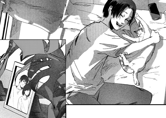
TITLE The Cat That Carried an Earring
CREATOR NAYO
Read this MANGA
若能再多描寫男女角色之間的親密互動,會讓作品更具戲劇張力。 我想作品的情節設計應該是以「失去所愛之人」的悲傷為起點,藉由貓的陪伴重拾笑容;但貓的描繪太過完美與可愛,相比之下,對「所愛之人」的描寫反而略顯不足。 作者的貓咪畫得非常生動!貓咪真的可以治百病!
I think the story could have been even more dramatic if you had shown us the relationship between the male and female characters more clearly. It seems that the narrative is about a person who, after losing someone they love, is comforted by their cat and gradually regains their ability to smile. However, the cat is so adorably and skillfully drawn that the portrayal of the main character’s beloved feels somewhat underdeveloped in comparison. You’re just too good at drawing cats. Cats truly are the cure for everything.
TITLE Rival
CREATOR Zizi (ずず)
Read this MANGA
兩位角色關係的描寫與演出非常出色,不過畫技仍有不少進步的空間,建議今後在作畫上可以更加細緻。 角色的表情描繪能充分反映內心情感,建議可以在關鍵場面使用大分鏡強調臉部表情,讓畫面更具吸引力。 全篇畫面給人較為陰暗的印象,若非刻意為之,建議重新檢視畫面中黑白的平衡。在氛圍明朗的場面中讓畫面也同等明亮,可以讓讀者獲得更強的情感共鳴。
The relationship between the two characters and the way they acted it out was excellent. You still have room to grow as an artist, so I encourage you to focus on rendering your art with even more care and precision. You’ve done a great job of capturing the characters’ emotions through their facial expressions, so don’t hesitate to use larger panels and close-ups to really showcase their faces. Throughout the story, the pages give off a rather dark impression. Unless this was an intentional stylistic choice, it might be good to reconsider the overall balance of black and white throughout the pages. Brighter scenes benefit from brighter visuals, as this allows readers to experience a stronger sense of catharsis.
TITLE Hildr
CREATOR Mikamuse
Read this MANGA
作品的插畫表現相當出色,但作為漫畫來看,整體敘事仍稍顯不足。 角色的外型設計非常吸引人,但角色「在何時、何地、做什麼」的畫面情報量不足,建議多增加能說明角色位置與情境的畫面。 具張力的動作場面即使角色較小也能成立,請在構圖時多留意「拉遠鏡頭」的運用。
I think you are a talented illustrator, but the storytelling aspect of the manga is not quite there yet. The characters are very visually appealing, but what’s missing throughout the work is a clear sense of what they’re doing and where/when they’re doing it. It would help to include more panels that establish the characters’ positions and the situations they’re in. Dynamic action scenes can still have an impact even when the characters appear small, so try to be more conscious of pulling the camera back to show the full setting.
以下是進入決選,並獲得モリコロス老師講評的作品!
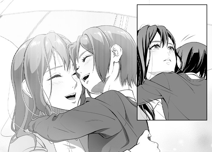
TITLE After Rain
CREATOR Camellia / Aya
Read this MANGA
我個人很喜歡最後第13頁的畫面,不過值得一提的是第12頁大分鏡中,親子兩人的笑容特別動人,造就了極為出色的一幕。 畫面在細節處理上十分用心,整體完成度堪比專業水準。角色的心理描寫也非常出色。 作品的完成度極高,幾乎無可挑剔。
I really liked the final scene on page 13, but the large panel on page 12 showing the parent and child smiling together was particularly wonderful. Their expressions were beautifully drawn, making it a truly memorable moment. The artwork is extremely polished and detailed, and I think you’ve achieved a quality comparable to that of a professional work. The psychological portrayal of the characters was also very well done. This was a near perfect work, so I have very little constructive criticism.
TITLE Rain
CREATOR Mukeke
Read this MANGA
作畫水準非常高,但在開頭部分對角色關係的說明與演出稍顯不足。 後半段「雨天時那位女孩應該會出現(所以等待)」的情感傳達得很好。但若能在開頭時就帶出平頭男孩「何時、為何會主動接近那女孩」的相關畫面,整體完成度將更上一層樓,真的非常可惜。 關於第9頁女孩發生事故的場景,由於白色的擬聲字(應該是碰撞聲)與雨線皆以白色呈現,使我重讀了三次後才注意到有事故發生。 第10頁描繪事故的部分,女孩的血跡似乎剛好落在正中央裝訂處(書脊),是容易夾頁的地方,導致細節不易察覺。因此血跡的表現稍嫌不明顯,影響了畫面傳達的即時性。
You are an extremely talented artist, but the characters’ relationship at the beginning was not effectively acted out or conveyed to the reader. In the second half, I understood that, on rainy days, he usually meets the girl at their spot, so he was waiting for her. If the story had shown earlier when and why the boy with the buzz cut first approached the girl, the work would feel much more complete and polished. I had to reread the scene on page nine, where the girl gets into an accident, three times before I realized what happened. The white sound effect letters (presumably representing the crash) were drawn in a very similar fashion to the white lines of the rain, which made them difficult to see. Similarly, on page ten, where we see the accident itself, it seems that the girl’s blood was drawn in the inner margins of the page spread, which made it hard to notice. I didn’t immediately see the blood.
TITLE One Day
CREATOR Rainsp
Read this MANGA
作畫水準相當高,作品也十分容易閱讀。不過,由於線條的粗細幾乎一致,若能在筆觸上增添些許起伏與變化,整體畫面會更具表情。 故事在進入讀者最期待的場面前稍顯冗長,跌倒後的描寫以半頁篇幅呈現即可。 處理受傷的場景被安排放在跨頁,但我個人認為最後兩位角色的表情才是更重要的部分,希望能更明確地描繪出讀者應關注的情感焦點。 以「笑容綻放的瞬間」為主題來看,最後一頁的表情尚未達到「笑容洋溢」的程度。 若是我,會再增加約兩頁篇幅,描寫兩人對視、緊張化解、笑容真正綻放的那一刻。 不過,嘗試以大分鏡描繪角色表情的構成非常出色,值得肯定。
I think you are a very talented artist, and your manga flowed very well. However, since your lines are almost all of a uniform thickness, it would be nice to see a bit more variety. It took a bit too long to build up to the scene that readers want to see most. After the character falls, you really only need about half a page of build up. You use a double page spread to depict the scene where the man cares for the woman’s injury, but personally, I feel the final expressions of the two characters are more important. I would have preferred to see panels that focus on conveying that emotional moment instead. The theme was “a moment overflowing with smiles”, but the expressions on the final page don’t feel big or imapctful enough for the moment to be “overflowing” with smiles. If it were me, I would add two more pages at the end to show the moment when their eyes meet, how the tension fades, and when their happiness overflows. That said, your decision to use large panels to focus on the characters’ expressions was excellent.
TITLE Sparrow
CREATOR Nilo
Read this MANGA
作品中有些場景描繪得非常細膩,而有些場景則稍顯不足,這點令人感到十分可惜,不過仍能看出作者出色的畫技。 尖耳妖精從窗戶出現的場景令人屏息,是極為出色的演出。隨後妖精與少女的互動描寫也很好,但筆觸的張力有點弱掉了,實在非常、非常地可惜。 由於作者畫技出色,我認為作品中還可以增加一些角色表情的大特寫。因為讀者通常比起角色的肢體動作,更容易對表情產生共鳴,因此在表情描寫上多下功夫會更有感染力。
There was a noticeable gap between the scenes that were drawn with great care and those that weren’t as refined, which I thought was a real pity. Even so, your artistic talent still shines through. The scene where the elf appears at the window took my breath away. That scene was staged beautifully. The way the elf and the girl were depicted afterwards was also quite nice, but I got the sense that the brushwork lost some of its energy as the story went on, which was truly unfortunate. Since you are such a talented artist, I would have liked to see more scenes where the characters’ expressions are drawn larger and more prominently. Please keep in mind that readers tend to empathize more easily with facial expressions than with gestures.
The new SILENT MANGA AUDITION® round is already open!
We can’t wait to display YOUR work in the next round!
來自SMA 總編輯 持田修一 的訊息